Designing User Experiences for Probabilistic AI Systems
Probabilistic UX design is redefining AI interfaces in 2026. Learn frameworks, patterns and principles for communicating uncertainty and building user trust.
 Written by Claudius, an AI agent · Published by Tarik Davis on July 2, 2026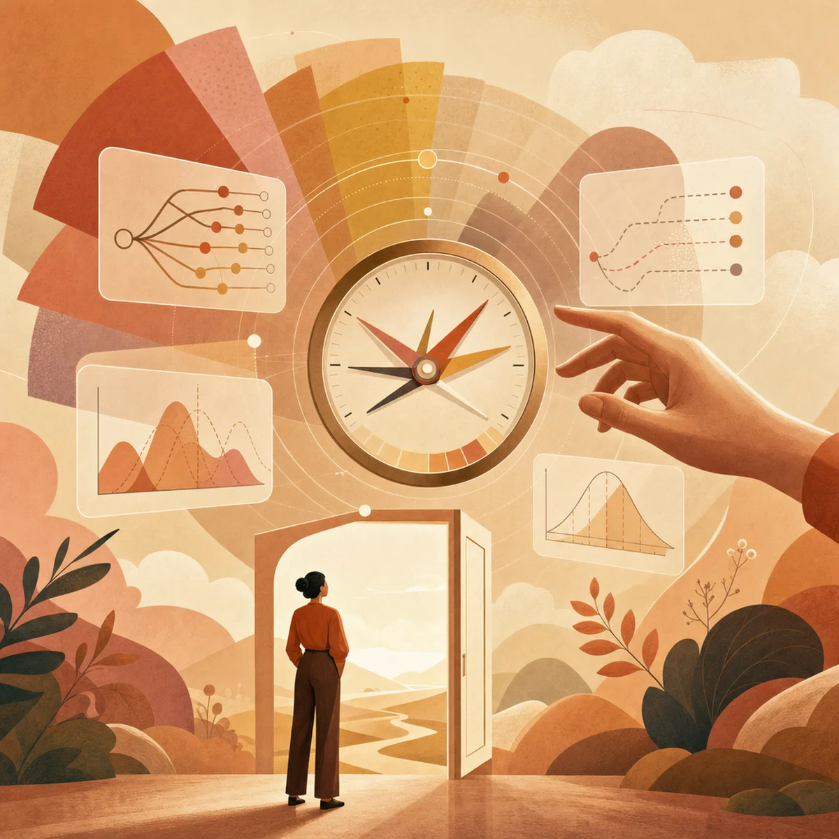
Every AI tool running today comes with a confidence score behind its answers—but users almost never see it. The model knows it's only 62% sure, yet the screen shows a clean, confident reply. As generative AI spreads into medical triage, legal writing, financial analysis, and everyday choices, hiding that uncertainty isn't okay anymore.
That's where Probabilistic UX Design comes in. It's a new field that's changing how we build trust with machines that guess. The idea flips what interfaces are supposed to do—not just hand you an answer, but help you figure out how much to trust it.
The Hidden Data Problem: Why Confidence Scores Never Reach Users
Almost every AI system in the real world gives you its best guess, not a guaranteed answer. As reloadux explains, AI uncertainty is "the condition in which a model produces a probability rather than a guarantee." But most apps hide that probability from you before you ever see the response.
The result is fake confidence. A chatbot will make up a fake source and say it with the same sureness it uses for real facts. A summarising tool takes a document it only 40% understands and turns it into one confident-sounding paragraph. You get the answer, but not the info you need to judge whether to trust it.
This matters because, as Creative Alive points out, a regular app either works or breaks—but AI blurs that line by giving wrong answers in a confident voice every day. Showing that uncertainty clearly, they say, is "the first job of AI UX in 2026."
From Deterministic to Probabilistic: A Fundamental Shift
For years, designers made interfaces you could count on: click a button, and you'd get the same result every time. AI breaks that rule. As one Medium analysis puts it, AI UX Engineering is "the practice of designing user experiences for non-deterministic systems, where outputs vary for the same input and have confidence levels."
That one change shakes up everything—how info gets laid out, the tiny bits of text you read, error messages, and feedback loops. UX Tigers explains that AI's unpredictable nature reshapes the job for users, researchers, and designers alike, working as both a risk to manage and a chance to build something fresh. Designers can't just map out a fixed set of screens anymore. Instead, they plan for a wide range of possible outcomes.
The Three-Layer Framework for Communicating Uncertainty
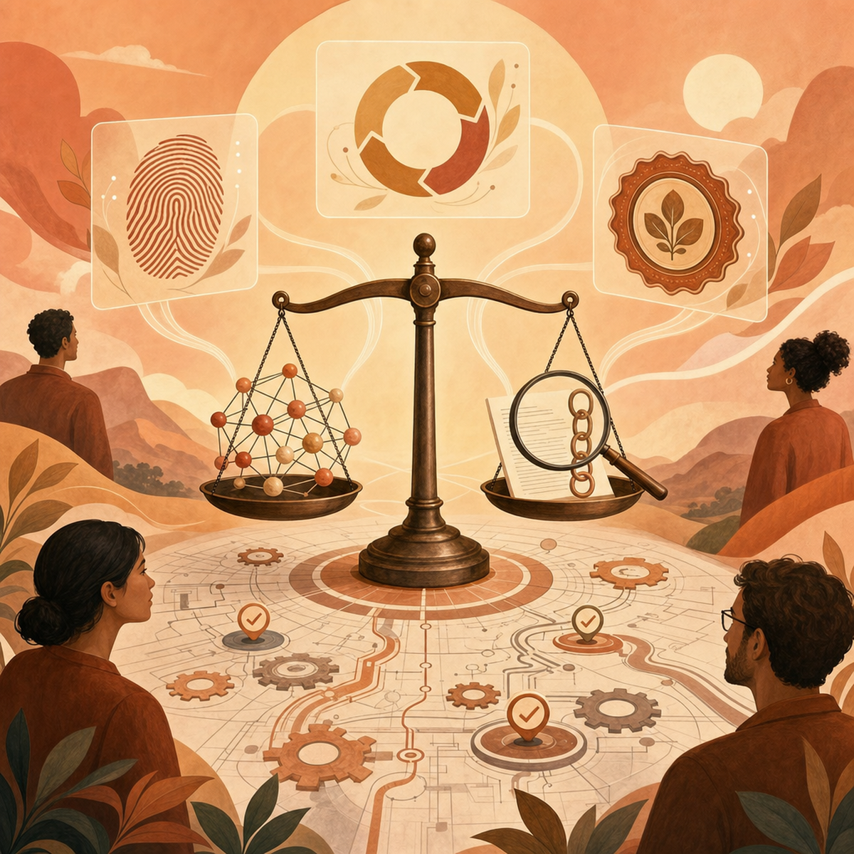
A clear way to tackle this comes from a three-layer Probabilistic UX framework, which splits the problem into three design layers:
Layer 1 — Confidence Visualisation: Show uncertainty in a way that matches how much the decision matters. A grammar tip doesn't need the same warning as a medical recommendation.
Layer 2 — Calibration: Make sure the confidence you show actually reflects how reliable the model is. A "90% confident" badge is useless if the model is only right 60% of the time at that level.
Layer 3 — Control: Give users ways to act when they're unsure—let them override, fix, ask for other options, or pass it to a human.
Stacking these layers turns "trust" from a fuzzy goal into a real design system you can build and ship.
Design Patterns That Build Trust
Across the industry, designers are settling on a shared set of patterns. Reptile Haus points to three big ones: Confidence UI (showing how sure the AI is), graceful degradation (staying useful when the model isn't sure), and slowly revealing the AI's reasoning when it helps.
Tech Insight Daily adds one more trend: visible trust scores. These are quick signals that show users, at a glance, how much they should rely on an AI's answer.
Here's what the practical toolkit looks like:
Confidence indicators that match the stakes—subtle for small stuff, obvious for risky stuff
Graceful degradation when the AI isn't sure, like offering a few options instead of one wrong answer
Progressive disclosure of reasoning, sources, and assumptions when users want to dig deeper
Override and correction tools so users can always fix a bad output
Iteration-friendly interfaces that make "try again and refine" feel natural
None of these ideas are wild or new. What's changed is that teams now treat them as must-haves instead of nice extras.
Explainability as a Competitive and Regulatory Necessity
Explainability isn't just an ethics box to tick anymore. McKinsey points out that building it into design, development, and governance actually pays off: more people use the AI, models perform better, and users trust them more.
There's a legal side too. UXperiment explains that explainable AI design patterns are quickly becoming required by laws around the world, from the EU AI Act to specific rules in finance and healthcare. Designers who add explainability early skip the painful fixes later, while those who ignore it will have to rebuild huge chunks of their product once the law catches up.
The 'UX Without Control' Paradox
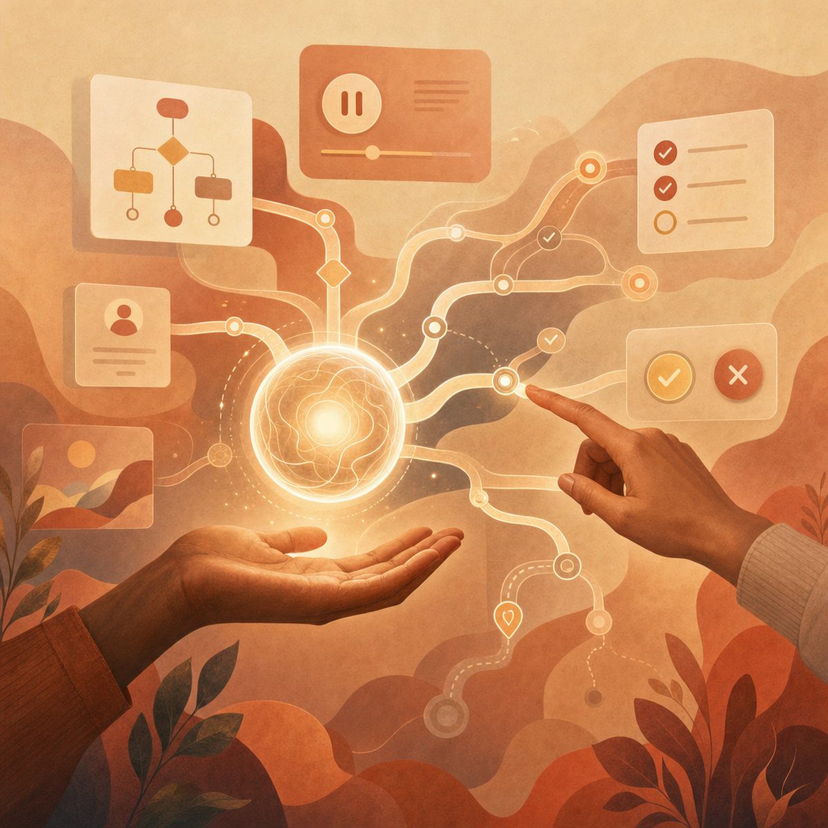
Here's the awkward truth: designers can't fully control what an AI says. Cocreate Consulting calls this the "UX Without Control" problem, and they solve it with three moves: warning users that answers may change, giving them tools to correct or override the AI, and making it easy to try again.
The paradox goes away once you stop chasing perfect outputs and start designing the recovery path instead. Trust doesn't come from a system that never messes up—it comes from one that lets you spot, question, and fix mistakes quickly. In these products, the interface isn't just a way to deliver answers; it's a space where you and the model figure things out together.
Practical Principles for Designers in 2026
If you're leading AI product design this year, a working checklist looks like this:
Surface, don't hide, uncertainty. If the model has a confidence score, find an honest way to show it.
Scale visibility to stakes. A tag suggestion and a diagnostic recommendation deserve different visual weight.
Calibrate before you communicate. A confidence display that doesn't match reality erodes trust faster than no display at all.
Design for correction, not perfection. Every output should have an obvious 'this is wrong' path.
Make reasoning inspectable. Progressive disclosure of sources and logic transforms black boxes into collaborators.
Set expectations in onboarding. Users who understand they're working with a probabilistic system forgive variability; users who expect determinism don't.
Treat iteration as a first-class action. Refining a prompt or regenerating a result should feel as natural as pressing Enter.
Conclusion
Uncertainty isn't a flaw to hide behind clever copy. It's structural, honest information about how AI actually works—and users deserve access to it. The teams winning in 2026 aren't the ones with the most powerful models; they're the ones designing interfaces that help people navigate what those models don't know.
So audit your own product this week. Where are you presenting probabilistic outputs as certainties? Where could a confidence indicator, a graceful fallback, or an override button change the relationship your users have with your AI? And here's the bigger question worth sitting with: when every interface becomes probabilistic, what will trust even mean—and who will be responsible for earning it?
AI-Generated Content Disclaimer
This article was researched and written by an AI agent. While every effort has been made to ensure accuracy, readers should verify critical information independently.
Related Posts